Building Features Students Don’t Even Notice
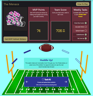
When students log into Fantasy Sports Math League for the first time, they’ll navigate the draft interface, scroll through their player statistics, and watch a football animate across their task tracker. If the design team has done their job well, none of these interactions will feel remarkable. Students will simply use the platform, focus on the math, and enjoy the game.
And that’s exactly the point.

“I want to take complex systems and make them easily digestible for a modern audience,” explains Kalin Ramsey, the lead designer and developer behind Fantasy Sports Math League’s recent overhaul. As founder and CEO of Krux Design, Kalin has spent years perfecting the art of invisible design—creating features so intuitive that users never stop to wonder how they work.
But behind that seamless experience lies months of problem-solving, technical innovation, and meticulous attention to detail that most users will never see.
The Paradox of Great UX Design in Educational Software
There’s a fundamental paradox in user experience design for educational technology: the better you do your job, the less anyone notices you did it at all.
When Kalin tackled the redesign of Fantasy Sports Math League’s My Players page, he identified a frustrating user experience problem. As the game progresses through 18 weeks, each player accumulates weekly scores displayed in horizontal lists. Students wanting to compare Week 1 performance across all their players had to scroll through each individual player’s list separately—scroll, scroll, scroll, then move to the next player and repeat.
The solution? Synchronous scrolling across multiple horizontal lists.
“It was really cool for me to figure out how to get them all to scroll at the same time,” Kalin recalls. “So if you want to see week one information for all players, you just scroll in time and everything updates automatically. So we really simplified the user experience that way.”
From a technical standpoint, this required coordinating multiple interactive elements to respond simultaneously to a single user action. From a student’s perspective, it just feels like the platform is reading their mind.
That’s invisible design at work.
Simplifying Complex Data: When Hundreds of Choices Become One Elegant Interface
Another example of hidden complexity lies in the drafting interface—one of Kalin’s proudest achievements on the project.
Fantasy Sports Math League presents students with hundreds of potential players to choose from during the draft. Managing this volume of information while keeping the interface clean and understandable posed a significant design challenge. Too much information overwhelms users. Too little leaves them unable to make informed decisions.
The solution involved creating a multi-layered system: first, incorporating player photos and team IDs to make the selection process visual and engaging. Then, developing a way to compress selected players into a mathematical equation that reads intuitively.
“We’ve really taken it to the next step by adding, you know, player photos and along with their team IDs,” Kalin explains. “We’ve compressed that into a mathematical equation that reads well and… It’s just such a really intuitive process.”
Students see a clean, organized interface where their selections make sense. They don’t see the data management architecture, the conditional display logic, or the careful information hierarchy that makes it all possible. They just draft their team and move on to the game.
Again: invisible design.
Visual Feedback in Educational UX: Guiding Users Before They Know They Need Help
Kalin’s design philosophy extends beyond static layouts to the micro-interactions that guide users through the platform. He emphasizes giving students visual feedback before they even know they need it.
“I want things to be obvious when people are hovering or selecting certain elements that they’re doing something,” he notes. “I want them to be able to get that visual feedback without needing to interact in a specific way that I know they need to interact in order to make it work. I want it to be obvious to them that they can interact with it in that way before they know that they have to.”
This means carefully crafted hover states, subtle animations, and responsive elements that communicate their interactivity through visual cues. A button might slightly change color when a cursor approaches. An element might have a gentle shadow that suggests it’s clickable. An animation might smooth the transition between states so the change feels natural rather than jarring.
These micro-interactions happen in milliseconds. Students process them subconsciously. But each one required deliberate design decisions, technical implementation, and testing to ensure it enhanced rather than distracted from the learning experience.
Consider the weekly task tracker featuring an animated football that progresses from field goal to field goal as students complete activities. It’s a delightful touch that reinforces the fantasy sports theme while providing clear progress feedback. Creating it required animation skills, an understanding of user motivation, and the technical ability to tie the visual element to backend data tracking.
Students see a fun football animation. Kalin sees hours of work perfecting the timing, easing functions, and data integration.
User-Centered Design for Education: Building for Students Who Don’t Know What to Expect
Perhaps the most challenging aspect of creating educational technology is designing for users who may have no frame of reference for what they’re encountering.
“Everything I build is not with the intention of how would I like it to work,” Kalin explains, “but I try to think in a mindset of someone who doesn’t really know what things are supposed to do, how they’re supposed to work, and I make it work for that person.”
This requires setting aside personal expertise and approaching the platform with fresh eyes—repeatedly. It means user testing with actual students. It means watching where they hesitate, where they click incorrectly, and where their intuition leads them astray. Then it means redesigning until those friction points disappear.

For Fantasy Sports Math League, this meant ensuring that students could navigate the platform without extensive tutorials or hand-holding. The hierarchy of information had to be immediately clear. The most important elements needed to be obviously important. The interactive elements needed to invite interaction without requiring explanation.
“I take hierarchy of skill very seriously,” Kalin notes. “Most important information organized the way it needs to be, but also the interactions.”
Getting this right means students can focus on learning math through fantasy sports rather than learning how to use the platform. The technology disappears, and the education remains.
The Technical Architecture Behind “Simple” Educational Software
What makes invisible design particularly challenging is that simplicity for the user often means complexity for the developer.
That synchronous scrolling feature? It required understanding event listeners, state management, and how to efficiently update multiple DOM elements without causing performance issues. The draft interface with player photos? That meant setting up a robust data pipeline, implementing image optimization, and creating fallback systems for when photos aren’t available.
Every “simple” feature students use represents technical decisions about architecture, performance, scalability, and maintainability. Kalin’s background spanning graphic design, UX/UI, and full-stack development allows him to make these decisions holistically, considering both the immediate user experience and the long-term technical implications.
“I’ve been, like you said, I started off with graphic design and UI, UX design, early on in my career for about seven years,” Kalin explains. “And as a result of that, I always have the end user at the forefront of my mind.”
This dual perspective—artistic and technical, user-focused and system-aware—is what enables truly invisible design. It’s not enough to know what should happen from a user perspective. You also need the technical chops to make it happen efficiently and sustainably.
Meeting Modern UX Expectations in Educational Technology
Today’s students have grown up with sophisticated apps and games that set high bars for user experience. They expect things to be smooth, responsive, and visually polished. They expect feedback, animation, and interfaces that feel alive.
“Keeping in mind how user expectations evolve over time, I want things to be a little bit more smooth,” Kalin says. “So I’ll add maybe some slight animations.”
But in educational contexts, there’s a careful balance to strike. Too much animation becomes distracting. Too many interactive elements overwhelm. The goal is to meet modern expectations while maintaining focus on learning outcomes.
Fantasy Sports Math League achieves this through restrained elegance. Animations serve a purpose—they guide attention, provide feedback, or smooth transitions. Visual flourishes reinforce the theme without overwhelming the content. Interactive elements invite engagement without demanding it.
Students feel like they’re using a modern, professional platform because they are. But they’re never fighting the interface or getting lost in unnecessary complexity.
Why Invisible Design Matters for Learning Outcomes
The invisible design work behind Fantasy Sports Math League matters because it directly impacts learning outcomes. When students struggle with an interface, their cognitive resources go toward figuring out the technology rather than engaging with the content. When navigation is confusing, frustration builds and motivation drops.
But when the platform just works—when students can focus entirely on drafting their team, tracking their players, and learning the math concepts embedded in the game—that’s when educational technology fulfills its promise.
The simplification of the user experience that Kalin achieved didn’t happen by accident. It happened through intentional design decisions, technical problem-solving, and a commitment to putting learner needs first.
The Art of Disappearing: Success in Ed Tech UX Design
In most fields, good work gets noticed and celebrated. In UX design for educational technology, good work gets used and forgotten—in the best possible way.
When Fantasy Sports Math League launches and students log in for the first time, they probably won’t think about the synchronous scrolling. They won’t marvel at the data architecture behind the draft interface. They won’t consciously appreciate the hierarchy of information or the subtle hover states guiding their interactions.
They’ll just play the game, learn some math, and have fun.
And somewhere, Kalin Ramsey will know that’s exactly what success looks like.
Fantasy Sports Math League is a digital learning platform developed by STEMPlay Labs, dfusion’s game-based learning division. The platform combines fantasy sports excitement with mathematical learning through carefully designed user experiences that make complex concepts accessible to students. Learn more about the design philosophy behind the platform in our full interview with designer Kalin Ramsey.
Key Takeaways for Ed Tech Developers and Educational Technology Design
The best educational technology is invisible. When students can focus entirely on learning rather than navigating the platform, you’ve succeeded.
Simplicity for users means complexity for developers. Features that “just work” often require significant technical sophistication behind the scenes.
Visual feedback should precede understanding. Design interfaces so users know what they can do before they need to do it.
Modern expectations matter in educational software. Students expect smooth, responsive, visually polished experiences—but in educational contexts, restraint is key.
Test with real users who don’t know what to expect. Your intuition as a designer isn’t enough; watch actual students use the platform and redesign based on their behavior.
Multidisciplinary skills create better ed tech outcomes. Combining design sensibility with technical capability allows for holistic decision-making that serves both user experience and system sustainability.
Focus on learning, not the interface. The ultimate goal of educational technology UX design is to make the technology disappear so learning can take center stage.
Related Topics: game-based learning platforms, STEM education software, user interface design for students, ed tech best practices, educational app development, learning management system design, student engagement through technology
This article features insights from Kalin Ramsey, founder and CEO of Krux Design, who specializes in UX/UI design and full-stack development for educational technology platforms.